
On occasion you might have a logo that works beautifully on the desktop but looks like the ugly duckling on mobile. Well, with Divi, it’s really quite easy to switch your logo using a little bit of CSS.
The Mobile Logo
The first step is to upload a mobile version of your logo and copy the url of the image’s location. To find the file url, you’ll need to “edit” the image. Once you’re on the Edit Media page, you’ll see the File URL under the Save widget (normally on the right).
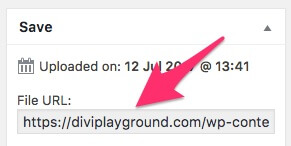
Click on the URL and then press Command + A (Mac) or Ctrl + A (Windows) and then either right click the highlighted text or use a keyboard shortcut to copy and paste it somewhere to use later.
The CSS
Now that you have the URL of the image you want to use on mobile devices, you need to place the following CSS into your child theme’s style.css file. If you aren’t using a child theme (and yes, you should be), head on over the Divi Theme Options panel and add the CSS to the Custom CSS field at the bottom of the page.
As you’ll see, there are two parts to this CSS and you might not need to use the second which restricts the width of the logo.
Now that you’ve got the CSS in place, head back to the URL of the image you want to use on mobile devices and replace the URL in the first piece of CSS.
Both these pieces of CSS use media queries to restrict their use to screens with a horizontal resolution of 980px or less.
Wrapping It Up
How easy was that? Now you can have a completely different logo on mobile devices to what you use of the desktop version of your site.
If you’re looking to play around a little more, check out my article called Increase The Size Of Your Divi Mobile Logo and Mobile Menu Text.
Photo by Maarten Deckers on Unsplash


This works for me when testing on desktop (with small viewport), but in actual mobiles it just shows a red outline and the alt text. http://Www.acornvillages.com
Hi Ian,
Try disabling any caching plugins that you have enabled. This is the URL that it’s trying to use for the logo: https://www.acornvillages.com/wp-content/cache/et/77/%E2%80%9Chttps:/www.acornvillages.com/wp-content/uploads/2018/04/logo-mobile.png.
Cheers,
Rob
This isn’t working for me either. I’m doing it in reverse by letting the default logo be the mobile and making the modification to larger devices with @media all and (min-device-width:982px) {} and firefox is picking up the mod and the path to the image is good, but it does not replace the image. Any ideas?
Remove quotation marks around image url and add !important after.
Not the most clean implementation but it works. Thanks!
Yup. It was totally the copy/paste bad ASCII “quotes” characters. Replace the quotes with your own typed quote and it will go back to the correct CSS character. Works like a charm then.
It is not showing, Its also appear breaked image icon in mobile device instead of desired logo.
Any One help please.
I am getting the same result. Will let you know if I fix it.
Thanks for the very simple and awesome fix.
It doesn’t seem to work in Firefox, not sure why, but works great in Safari and Chrome, which is really what everybody uses on mobile anyway.
Careful: You are using quotation marks in your css code snippet that do not work when transferred with copy and paste. Anyone using the code above should change the quotation marks from “ to “.