
In this tutorial I’m going to show you how to add text to the right hand side of Divi’s mobile menu (the hamburger) and change the hamburger to an X when the menu is opened.
The Example
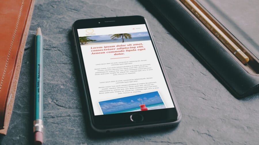
You can check this out at my Beach House Divi layout demo.

The CSS
Add the following CSS to either your child theme’s style.css file or in the Custom CSS field of the Divi Theme Options General tab.
Depending on how you’ve sized your menu bar, you’ll probably have to play around with the bottom value of in the CSS.
The End
And there you have it, a super easy way of making the hamburger mobile menu a bit more understandable to those who might not know what it is. You might also want to check out the post Switch The Normal Divi Menu To the Hamburger Menu on Smaller Screens.
Divi Notes started as a way to document my own WordPress and Divi web design/development journey and, to my delight, has grown to become a helpful resource to many other Divi users out there. If you’ve found Divi Notes to be useful in your journey, I’d appreciate it if you would consider supporting me using the form below.


This is a nice and handy little tutorial. Good job, thank you!
Not sure why mine isnt working. Ii have some other css for the menu, but I don’t see why it should conflict 🙁
great snippet of code>works perfectly.
Hello I want to show text on left side abd i added before tag instead of after but it is not working with before tag some randon icons are showing.Can you please tell me the solution??
Hi Sandesh, try adding font-family: sans-serif !important; to your CSS.
Hi there. On a small screen (smartphone), the word “MENU” is partly outside the screen – I can see like “ME” only. Hoe to fix it?