How often haven’t you created a line of buttons only to have them not line up because of the varying height of the content above it? In this tutorial, I’ll show you how to use the Position settings to horizontally align the buttons to each other so they are in line with each other.
Getting Started
I’ll assume that at this point, you have a row with a couple of columns in place and that in each column you have something like a Divi Blurb module and a Divi Button below it. It’ll look something like this:

adipiscing elit
Lorem ipsum dolor sit amet, consectetur adipiscing elit, sed do eiusmod tempor incididunt ut labore et dolore magna aliqua. Nisl tincidunt eget nullam non.

est lorem ipsum
Nisl tincidunt eget nullam non. Quis hendrerit dolor magna eget est lorem ipsum dolor sit.

ut labore et
Lorem ipsum dolor sit amet, consectetur adipiscing elit, sed do eiusmod tempor incididunt ut labore et dolore magna aliqua. Quis hendrerit dolor magna eget est lorem ipsum dolor sit.
The Steps to lines the buttons up
Step One – EqualiZe the column heights
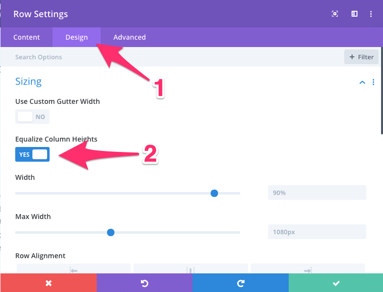
The first step in this process is to equalise the column heights, this is achieved by turning on Equalize Column Heights. You’ll find this in the Row Module settings under the Sizing on the Design tab. Equalizing the column heights makes all the columns the same height as the tallest column in the row.
Step Two – Set the Button’s Position to Absolute
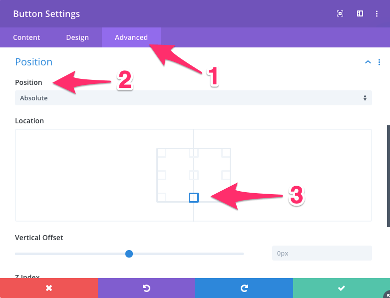
The next step is to set the Position of the buttons to Absolute and center the Location if that’s how you want it. You’ll find this under the Advanced tab of the Divi Button module.
Step THree – Set the Padding on the Tallest Row
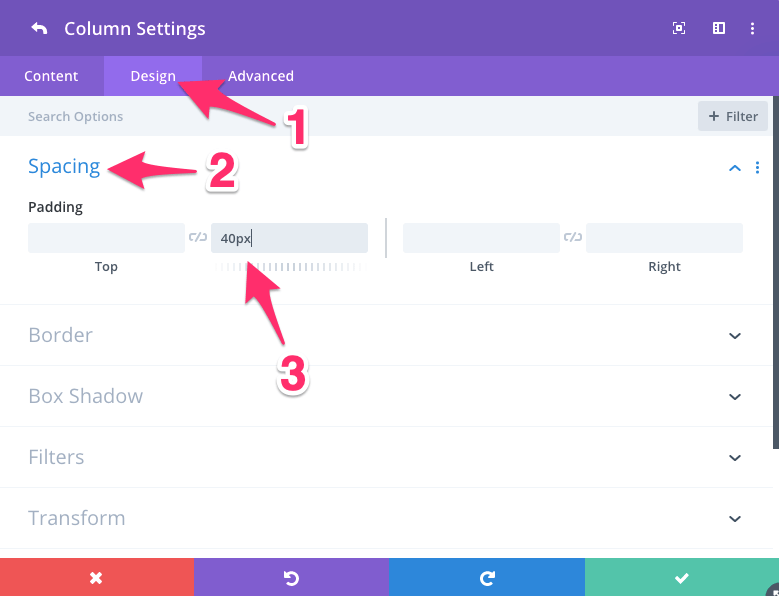
The third step is to set the padding on the tallest column of the row. Do this by opening the Row Module Settings window, then click on the Gear icon of the column in question.
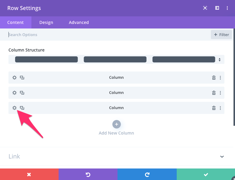
Now click on the Design tab and navigate to the Spacing section and add the desired amount of padding to the bottom of this column.
Step Four – Check the Spacing on Mobile
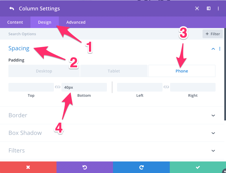
The last step is to make sure that the buttons are properly spaced on mobile. You might need to tweak it a little but in this example, I’ve made the spacing 40px.
The End Result – Four Simple Steps Later
The end result will look like this:

adipiscing elit
Lorem ipsum dolor sit amet, consectetur adipiscing elit, sed do eiusmod tempor incididunt ut labore et dolore magna aliqua. Nisl tincidunt eget nullam non.

est lorem ipsum
Nisl tincidunt eget nullam non. Quis hendrerit dolor magna eget est lorem ipsum dolor sit.

ut labore et
Lorem ipsum dolor sit amet, consectetur adipiscing elit, sed do eiusmod tempor incididunt ut labore et dolore magna aliqua. Quis hendrerit dolor magna eget est lorem ipsum dolor sit.
And There You Have It
There are a few other ways of doing this, and if you’d like, check out the article by Rob at Octygon call 3 Ways to Vertically Align Buttons in Divi. The method I’ve demonstrated here doesn’t require anything other than playing around with the settings already available in Divi.
So go ahead and banish those misaligned buttons now.
Divi Notes started as a way to document my own WordPress and Divi web design/development journey and, to my delight, has grown to become a helpful resource to many other Divi users out there. If you’ve found Divi Notes to be useful in your journey, I’d appreciate it if you would consider supporting me using the form below.


