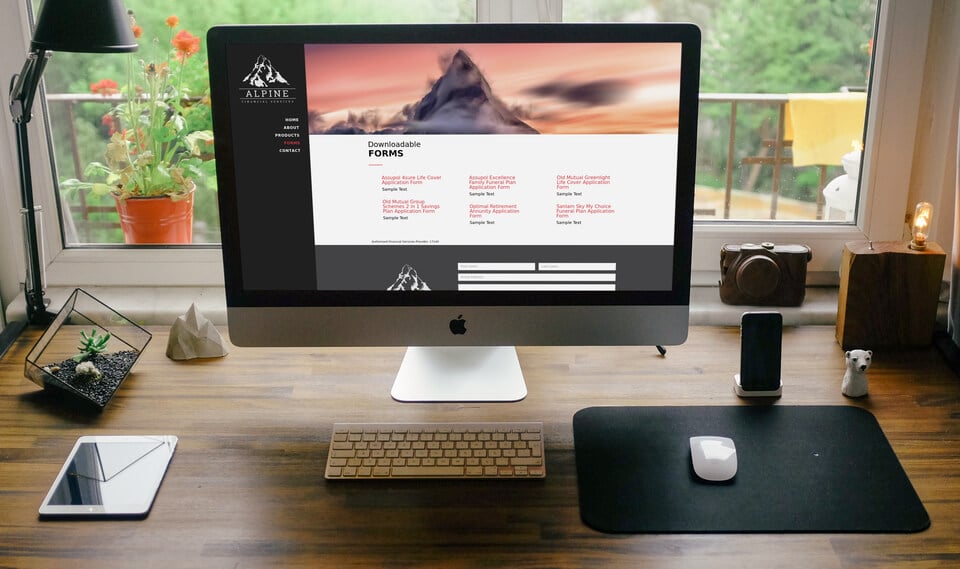
While working on a new site for a client who wanted the Vertical Navigation Header Format, I decided that the width needed to be increased. After a little scratching I got it right with the CSS below.
As you make your side menu wider your logo will grow with it.
UPDATE: If you have issues with the text of the menu wrapping, use pixels rather than a percentage and then manage it with a media query so that it doesn’t mess you around on different screen sizes. If you need help with media queries, check out Media Queries Demystified by emailonacid.com.
